
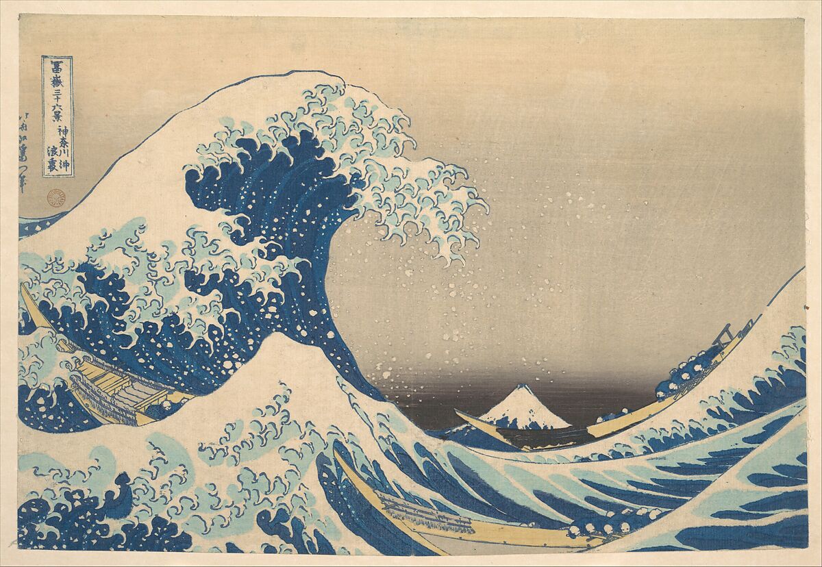
The wave seems enormous; Mount Fuji appears almost weightless. Boats cut diagonally through the sea while foam breaks into hooked shapes. Hokusai’s Under the Wave off Kanagawa does not need a broad spectrum to create drama. Its force comes from compression: dark blue against pale paper, repeated curves against a nearly still mountain, and a handful of carefully separated tones.
Five colours from the wave
The values below were sampled from the exact 1200 × 828 Open Access JPEG downloaded from The Met. They describe this digital reproduction, not universal pigment measurements: impressions, paper ageing, photography and screens can all change colour.
Deep Wave — #303E4C: the darkest blue-grey carries the outlines and compressed underside of the breaker.
Prussian Current — #33516B: the central blue gives the sea its cold weight. The Met’s research explains that printers combined indigo and Prussian blue and layered the printing to deepen the colour without losing intensity.
Sea Mist — #77888A: a softened blue-grey bridges dark water and pale foam, keeping the print from becoming a simple two-colour silhouette.
Weathered Paper — #E1CCAB: the warm ground is an active colour. It separates the wave from the sky while making the blues appear colder.
Foam Light — #F4E1C6: the lightest tone belongs to spray, crests and open paper. Used sparingly, it gives the image its sharpest rhythm.
How the palette creates motion
The composition is built on unequal proportions. Dark and middle blues occupy most of the active sea. Warm paper gives the eye room to breathe. The palest tone arrives in fragments rather than as one large area, so the foam feels broken, fast and airborne.
Hokusai also controls scale through colour and perspective. The wave fills the foreground, while Mount Fuji becomes a small pale triangle inside the curve of the sea. The Met describes this reversal directly: Japan’s grandest mountain is made to appear like a distant mound beneath the cresting wave.
The print belongs to Thirty-six Views of Mount Fuji, a series first published around 1831 that helped establish landscape as a major subject in Japanese print culture. The Smithsonian National Museum of Asian Art notes that its popularity led to ten additional designs, bringing the familiar total to forty-six.
Save the palette
Suggested ratio: 34% Deep Wave · 24% Prussian Current · 16% Sea Mist · 18% Weathered Paper · 8% Foam Light.
Use it as a starting point for an editorial layout, painting study or interior concept. Keep the lightest colour rare: the image gains energy because foam is an accent, not a background.
Anima Liriana view
The Great Wave is often remembered as a picture of overwhelming nature. Its visual intelligence is quieter. Hokusai makes danger legible through proportion: one stable triangle, three narrow boats, one rising curve and five tones that never compete for attention. The storm feels immense because the palette is disciplined.
SOURCES & IMAGE STATUS
The exact image used is marked Public Domain by The Metropolitan Museum of Art and supplied through The Met Open Access programme under CC0. No modern exhibition or press photography is reproduced. Checked 9 August 2026.